 Many drivers say Uber’s a cold, ruthless business while their rival Lyft is charming and playful more like Google. While Uber’s The company is ‘everyone’s private driver’ with their black branding making them feel like a premium high-class ride sharing service. The new look includes new app icons, region specific colors and backgrounds, new typeface, and more colorful and lively website. Why change something if it’s not broken? They’re one of the first tech companies heavily tied to politicians and hospitality. They needed to ‘humanize’ the company to help fight against the taxi industry and preventing their drivers from becoming ’employees’ and not ‘contractors’.
“Uber started out as everyone’s private driver,” Kalanick writes. “Today we aspire to make transportation as reliable as running water, everywhere and for everyone. Our new brand reflects that reality by working to celebrate the cities that Uber serves.”
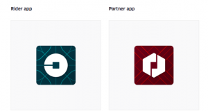
Here are the new apps icons. Which I may note doesn’t have a ‘U’ for Uber or really resemble Uber in any way:
The colors and textures resemble each countries architecture, art, fashion and environments of the relevant regions. Uber wants to go even further and create unique texture and color sets for each cities the service is in.
Uber’s new look make the service look less like a cold government organization but a startup competing for market share in an industry their disrupting.
Tell us in the comments below what you think about Uber’s new look and feel!