Windows 10 Project Neon goes back to the Zune days
Windows Central managed to grab a screenshot of Project Neon’s new design trends. Microsoft will bring the design trend to all their devices include computers, phones, Hololens, and possibly even the Xbox One.
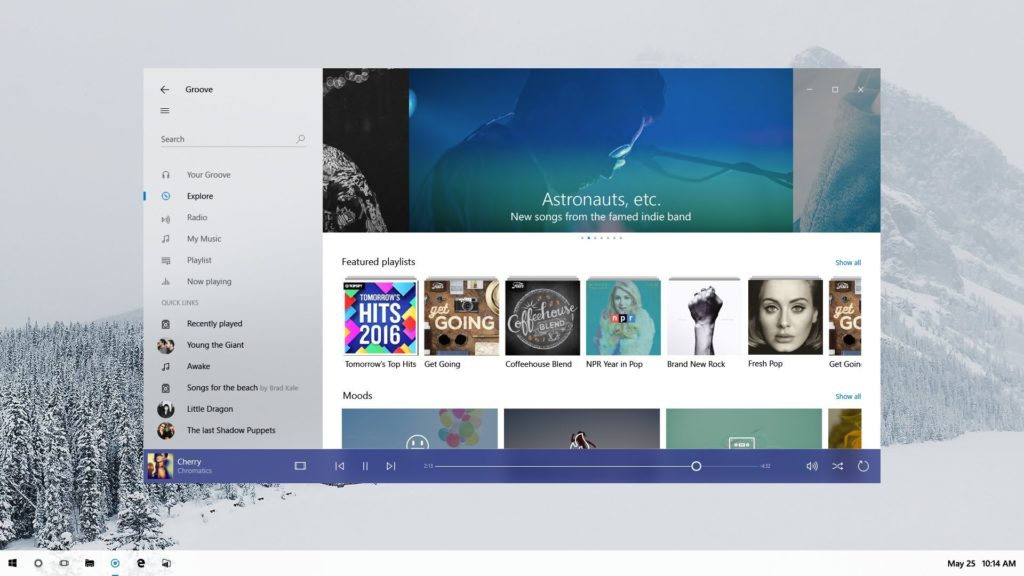
The refreshed UI looked a lot like what Microsoft did with the Zune. The overall look is flatter and overall more visually appealing. If you remember the Zune era, we had a lot of white space with light images in the background, much like what Microsoft did in the Groove app below.

Project Neon gives apps a fresh UI
Project Neon APIs are available in the latest Insider Preview builds of Windows 10, meaning developers can already start taking advantage of the new interface. There’s still not a lot know about Project Neon yet, but we expect to hear what Microsoft has up their sleeves at Build. During the conference, we should hear about Cortona making a bigger presence in Windows 10 but across all their platforms. They have to answer to Google Assistant and Amazon’s Alexa.
Regarding the move from Metro to Neon, we’ll see lighter colors, but they’re also going move away from Windows borders and other things we’ve come accustomed to. Windows 8 was the last significant change to their design language, with Windows 10 refining the failures of Windows 8. Since Windows 10 is the last version of Windows, Microsoft has to iterate within the smaller cycles. They don’t have to wait three or four years for a new big update to Windows to change the look and feel of the whole OS.
Neon focuses on animations and transitions, with the goal of making the core OS and apps appear to work in close collaboration. It’s all about user experience and fluid transitions. Something we’ve seen on MacOS and iOS for years now.
Tell us your thoughts on Windows 10 Project Neon. Do you like the new design language or do you prefer the Metro design in Windows 10? Tell us in the comments!