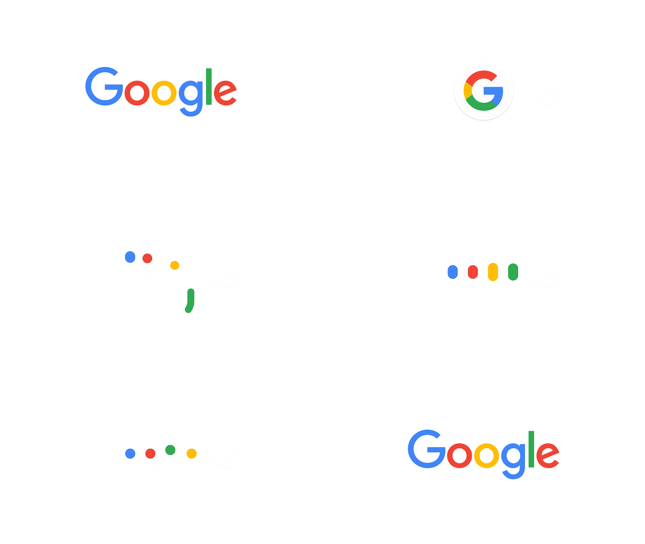
Google’s become a household and it’s logo is become an icon around the web and with our generation. Google unveiled Tuesday a new logo with a custom typeface, Product Sans, and a flatter design that looks more like Google’s material design. The type face, new flat colors, and refreshed G icon with four colors reflects how it’s working for you in today’s world.
“New elements like a colorful Google mic help you identify and interact with Google whether you’re talking, tapping or typing,” Google said. “Meanwhile, we’re bidding adieu to the little blue “g” icon and replacing it with a four-color “G” that matches the logo.”
Google has changed it logo over the past two decades, but the changes were small and minor. This update is a huge overhaul, and comes after Google announced its now apart of a larger company: Alphabet. While we haven’t seen a logo for Alphabet, the new logo for Google is being well received so far. Google notes that the new logo is easy to read on any size screen.
Google will change its logo over the next coming years, but the changes will be smaller and minor updates. The new logo’s and icons better represent Google on any platform whether it’s on Android, Android Wear, TV, phone, or on a computer screen. They all include the four colors that Google set well over 17 years ago.
Tell us in the comments below what you think about the new Google logo and icon!

